
Blog
A red-and-blue bezel remains visible after the dial text, rehaut engraving, and polished case edges have disappeared at normal conversation distance. A black-and-blue bezel behaves differently: the black upper half connects with the dial, while the blue lower section appears only when light reaches the wrist. This pepsi vs batman replica comparison examines that visible difference alongside bracelet style, wrist fit, daily clothing, collection use, QC photos, current version selection, packaging, and delivery checks.
The direct recommendation is Batman on Oyster for a first GMT-style watch or a model worn most weekdays. Pepsi on Jubilee makes more sense when the red-and-blue bezel is the main attraction, especially when several quieter steel sports watches already fill the daily rotation. The sections below explain where each option works, where it becomes awkward, and what should be checked before an allocated watch moves to shipping.
Lo más importante, para empezar
Batman Handles Repeated Wear; Pepsi Adds More to a Collection
For an unspecified pepsi vs batman replica shortlist, Batman on Oyster is the safer starting point. Its black upper bezel, blue lower section, and broad three-link bracelet work with pale office shirts, charcoal jackets, dark denim, olive outerwear, and simple travel clothing. Four or five days of wear in one week do not require the rest of the wardrobe to stay perfectly neutral.
Pepsi on Jubilee is the more expressive option. The red-and-blue bezel remains obvious from several steps away, while the five-link bracelet breaks light into many smaller reflections. That combination makes sense for weekends, holidays, evening casual clothing, and a collection that already contains black-bezel or plain-steel sports designs.
Neither nickname proves the quality of an allocated watch. Neutral-light bezel photos, a level dial image, both case sides, a double-digit date, end-link close-ups, clasp views, and a short operation video provide more useful evidence. Factory language can narrow the available versions, yet the visible condition of the exact piece still decides whether approval is sensible.
The practical rule
Choose Batman Oyster when one GMT must cover Monday meetings, a three-day city trip, and a casual Saturday. Choose Pepsi Jubilee when red and blue are the reason the watch is appealing, not a compromise accepted because the nickname is well known.
| Punto de decisión | Pepsi on Jubilee | Batman en Oyster | Clear call |
|---|---|---|---|
| Cuatro o cinco días a la semana | Colorful and polished, but more outfit-sensitive | Controlled color with cleaner bracelet lines | Batman |
| Existing neutral collection | Adds a recognizable red-blue role | May overlap with other dark sports watches | Pepsi |
| Small or rounded wrist | Jubilee wraps well, yet color increases visual width | Dark bezel and Oyster look more contained | Batman |
| Travel photographs and weekends | Higher recognition and stronger color presence | Easier with changing jackets and luggage | Pepsi for character |
| Primer reloj de estilo GMT | Memorable, though less forgiving | Simple to combine and easier to keep in rotation | Batman |
Design and wrist behavior
The Bezel Changes Perceived Size More Than the Shared Case Direction
Both designs follow the familiar modern GMT-Master II 40mm direction, yet a shared diameter does not create an equal visual footprint. Pepsi places a broad ring of contrast around the black dial. The red lower half separates sharply from the blue upper half, so the bezel becomes the first object seen before the hour markers or date window.
Batman behaves differently. Its black upper section connects with the black dial, while the blue half supplies color along the lower edge. Under office lighting, the black portion often recedes into the dial and makes the face appear tighter than the case measurement suggests.
Bracelet reflection adds another layer. Jubilee produces small flashes from many individual surfaces and visually extends Pepsi beyond the bezel. Oyster uses broader, calmer planes, which allows Batman to appear more compact and less decorative from the same viewing distance.
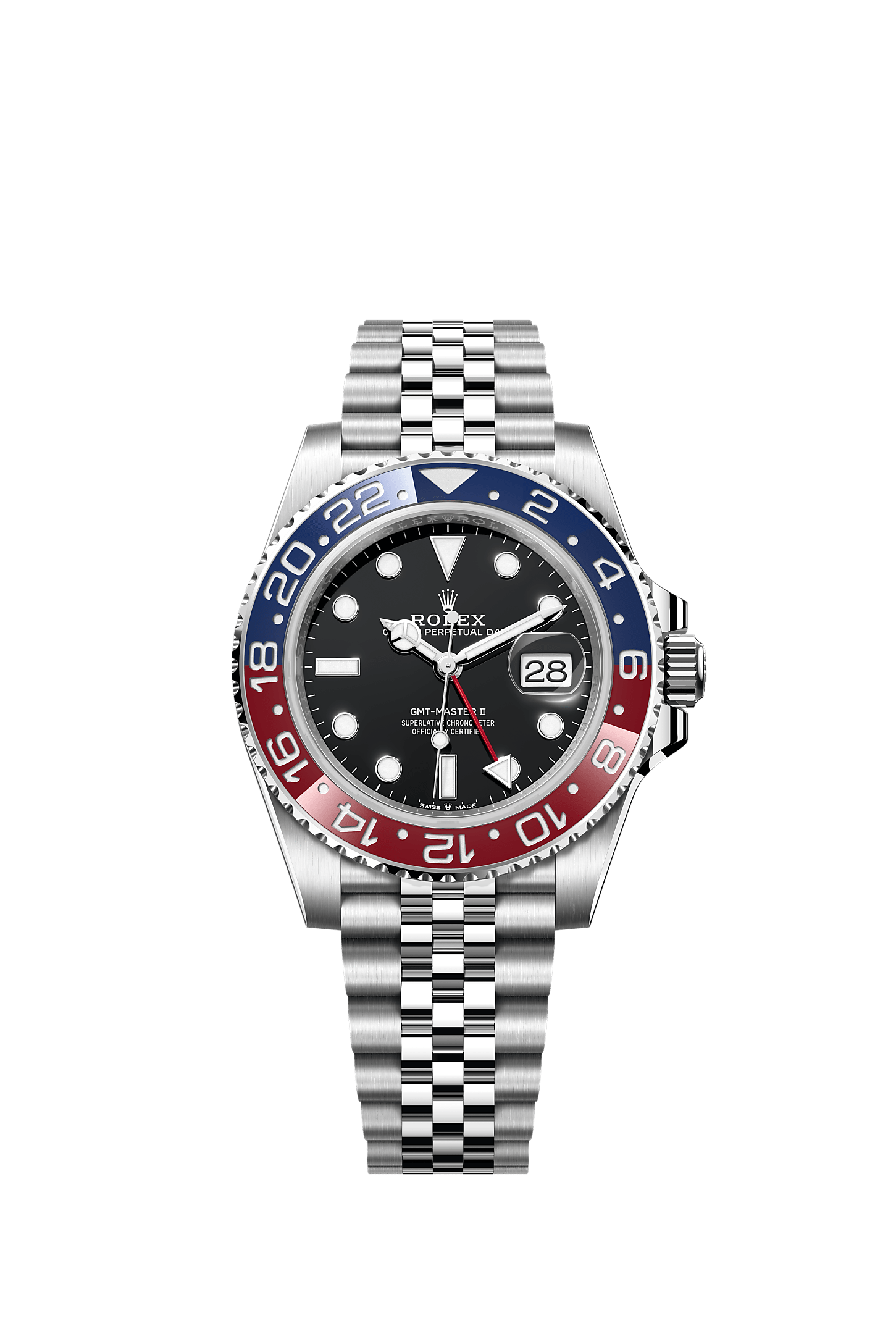
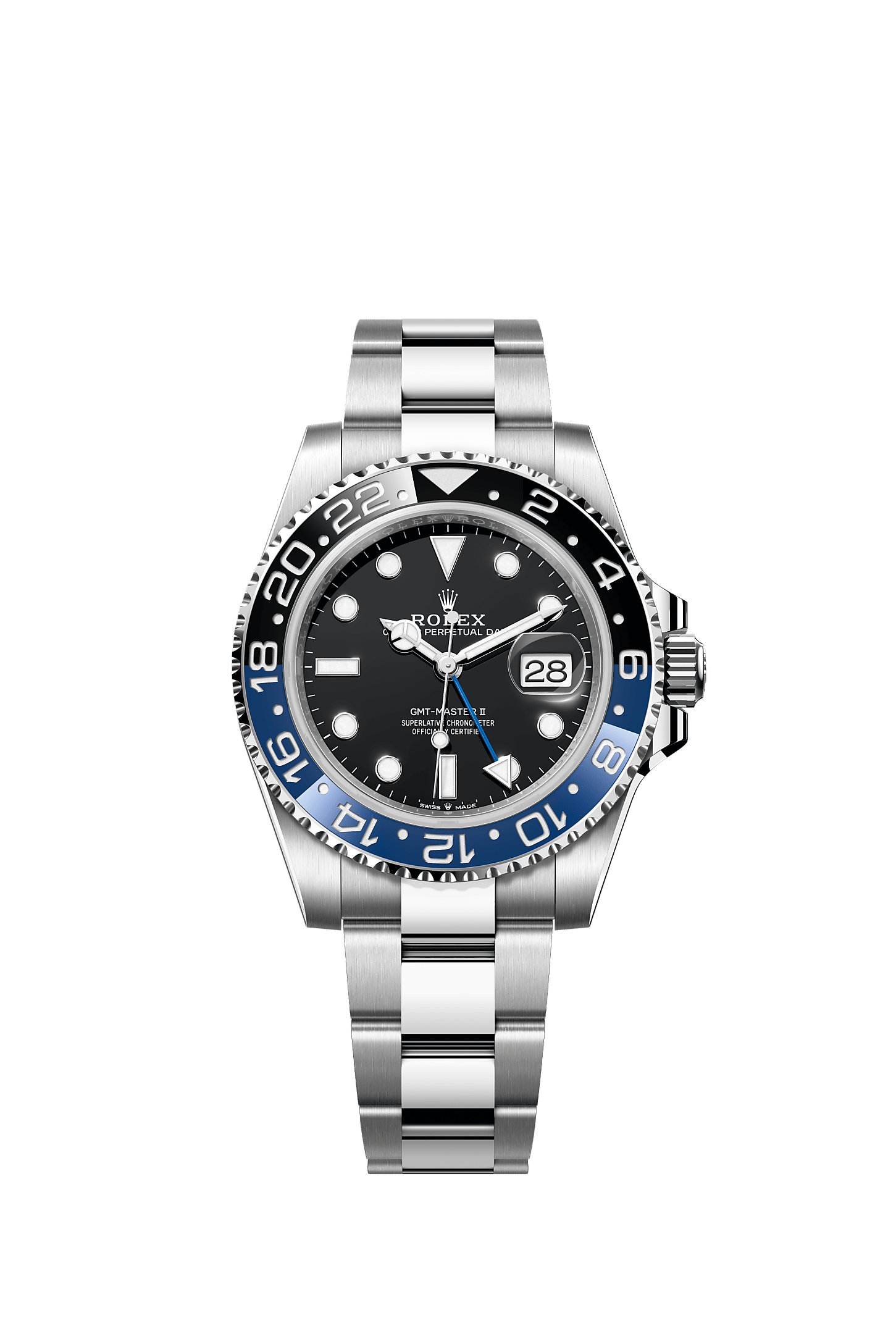
What remains visible at normal conversation distance
At roughly one to two meters, the bezel palette and bracelet reflection remain obvious. Fine dial printing, tiny rehaut details, and hand-edge finishing mostly disappear. A pepsi vs batman replica decision should begin with the features that still shape the watch during ordinary wear, not only those visible in a magnified phone photograph.
Pepsi looks brighter from the front and from a shallow side angle. A blue shirt cuff, warm restaurant lighting, or direct afternoon sun may shift the apparent colors, yet the red-blue bezel remains the first feature noticed. Batman stays quieter, and its blue section becomes more obvious when the wrist turns toward a window or overhead lamp.
The bracelet difference survives the same distance. Jubilee appears textured because its center links create many separate highlights. Oyster reads as three broad bands and looks cleaner beside a jacket sleeve, a notebook, or the strap of a travel bag.
Lighting can make a good color choice feel wrong for ten minutes
Display lighting often exaggerates both models. Strong white lamps can push Batman blue toward a bright electric tone, while warm light may make Pepsi red appear softer or slightly orange. A single photograph taken under one bulb is not enough to understand how either bezel will look during a normal day.
Neutral window light around late morning gives a useful baseline. An indoor photograph taken several steps away then shows whether the color remains comfortable under ordinary conditions. Together, those two views are more informative than a close-up created to make the insert look as glossy as possible.
The reaction at first sight also matters. Pepsi should feel intentionally colorful rather than acceptable after explanation. Batman should show enough blue to justify the model rather than looking almost identical to a fully black bezel in every image.
Dial, GMT hand, and date function do not create separate wearing roles
Functionally, both designs belong to the same GMT family. Each uses an additional hand against a 24-hour bezel and places the date under a magnifying lens near three o’clock. The colorway changes the mood, yet it does not create a different basic purpose for reading another time reference.
Color still changes how the GMT hand is perceived. On Pepsi, the red hand connects naturally with the lower bezel half and becomes part of a lively red-blue-black composition. On Batman, the blue hand sits more quietly against the dial, so clear contrast and visible length deserve attention in QC images.
The date deserves equal attention on both. A centered double-digit date, a level cyclops, and a clean relationship between the window and lens affect the face every morning. An attractive bezel cannot rescue a date that appears high, low, or visually twisted.
Thickness should be judged from the allocated watch, not a generic number
Replica case thickness may vary with the version, crystal, case construction, and individual piece, so a generic listing figure gives limited help. A straight side photograph provides better information. Bezel height, crystal height, crown-guard shape, and the caseback line show whether the watch may catch a cuff or sit high on a rounded wrist.
Pepsi can appear thicker even when the physical profile is comparable. Its brighter insert and Jubilee reflections keep attention on the full watch. Batman’s dark upper half visually compresses the case, while Oyster forms a flatter continuation away from the lugs.
For desk use, the clasp matters as much as the case. A bracelet sized too loosely lets the watch rotate and may bring the crown into the hand. A bracelet sized too tightly becomes distracting during warm afternoons, especially after several hours of typing, walking, or carrying luggage.
15–16 cm wrist
Batman Oyster usually looks more controlled, particularly on a rounded wrist. Pepsi Jubilee may still fit comfortably, though a front wrist shot should confirm that the bright bezel does not occupy nearly the full visible wrist width.
16–17.5 cm wrist
Both styles can work well. First-link drop, the flatness of the upper wrist, and preferred bracelet movement matter more than a small difference in circumference.
18 cm and above
Pepsi Jubilee carries color and reflection naturally on a broader, flatter wrist. Batman remains easy to wear, although it may look intentionally quieter rather than visually substantial.
Wrist shape can reverse a simple circumference rule
A flat 16 cm wrist may support the case better than a round 17 cm wrist. The flat surface gives the lugs and first bracelet links more room to descend. A rounded wrist can make the same case perch higher, even when the tape measurement appears generous.
A straight wrist shot and a side wrist shot are therefore more useful than circumference alone. The front image shows perceived width. The side image shows whether the first links fall naturally or flare outward before wrapping around the wrist.
Batman’s darker palette helps when fit is close to the visual limit. Pepsi’s articulated Jubilee may improve physical drape, yet the bright bezel can still make the watch appear wider. Physical comfort and perceived size should be judged separately.
Oyster feels calmer; Jubilee feels busier but more flexible
Oyster presents larger link surfaces and a firmer visual line from the case toward the clasp. On a flat wrist, that line looks clean and sports-focused. During a workday, fewer reflective points also keep the bracelet from becoming the most noticeable part of the watch whenever the hand moves across a desk.
Jubilee uses smaller articulated links, so the bracelet often follows wrist curves more readily. The same construction creates more highlights. A quick turn of the wrist under restaurant lighting can produce several flashes even when the bezel remains still.
Neither feel is automatically preferable. A bracelet video showing the watch lifted, lowered, opened, and closed gives more useful information than a still photograph. Link movement, clasp position, visible brushing, and the way the bracelet falls under its own weight can all be seen in a clip lasting less than thirty seconds.
Where each watch earns its place
A Normal Week Favors Batman; a Varied Collection Gives Pepsi More Room
A watch selected for ordinary life faces more combinations than a watch selected for one photograph. Monday may involve a pale shirt and charcoal trousers. Wednesday may bring denim and a rain jacket. Saturday may mean a white T-shirt, plain sneakers, and a late dinner. Batman moves through those changes with less friction.
Pepsi works best when the surrounding clothing stays restrained. Navy, white, grey, denim, beige, and black leave enough visual space for the red-blue insert. When an outfit already includes bright red, strong royal blue, or several competing patterns, the wrist can begin to look busy.
Wear frequency explains why this difference matters. A piece worn twice a week can afford to be specific. A piece worn five times a week needs a wider range, and Batman’s darker palette becomes more useful than Pepsi’s stronger signature.
Office clothing: Batman stays present without interrupting the room
With a white or pale-blue shirt, navy trousers, and a charcoal jacket, Batman looks connected to the clothing rather than placed on top of it. The blue bezel section echoes familiar office colors, while the black half keeps the face grounded beside a laptop, notebook, or dark leather bag.
Oyster also suits repeated desk use. Its broad links create less visual shimmer when the hand moves between a keyboard and a coffee cup. The clasp may still contact the desk surface, so correct sizing remains more important than whether the bracelet looks impressive in a close-up.
Pepsi can work in the same setting, especially with a plain white shirt and dark jacket. It becomes a deliberate style point, though. The watch will be noticed earlier, which is useful when color is welcome and unnecessary when a quieter meeting-day piece is preferred.
Travel days: Batman is easier to pack; Pepsi looks stronger when the trip is part of the story
A three-day trip often contains more clothing changes than expected. A dark technical jacket appears at the airport, a cotton shirt comes out for dinner, and a sweatshirt covers the watch during an early return journey. Batman handles those shifts without creating a need for a second watch.
Pepsi offers a different benefit. In airport lounges, hotel windows, outdoor cafés, and travel photographs, the red-blue bezel communicates the GMT idea more clearly. It looks connected to movement and destination even when the additional hand is used only as a simple home-time reference.
Practical travel checks still come before style. The clasp should close cleanly, the bracelet should not slide over the wrist bone, and the crown should not press into the hand while a bag is being carried. A memorable bezel does not compensate for poor sizing during a six-hour journey.
Weekends: Pepsi becomes easier once the clothing becomes simpler
A white T-shirt, dark denim, and plain sneakers create a clean background for Pepsi. The bezel supplies the color that the outfit lacks, while Jubilee adds enough polish for lunch or an evening bar without requiring a change into formal clothing.
Beige knitwear also works well because it does not repeat either bezel color. Navy outerwear is another natural match, although a very bright blue jacket may compete with the insert. Black jeans and a grey sweatshirt keep the result relaxed and allow the watch to remain the only strong accent.
Batman remains useful on weekends, but it does not change character as much. With an olive overshirt, black denim, and boots, it feels like a compact sports watch. That reliability is useful in a small rotation and less valuable in a box already filled with dark-bezel models.
Five outfit tests that reveal the answer quickly
White shirt + navy trousers
Batman blends naturally. Pepsi becomes the visible accent.
Black denim + olive overshirt
Batman feels connected and purposeful. Pepsi may appear separate.
Grey knit + beige trousers
Pepsi adds welcome color. Batman remains quiet and controlled.
Travel jacket + backpack
Batman adapts more easily across changing settings and layers.
White T-shirt + dark denim
Pepsi has enough room to lead without looking forced.
A seven-day rotation test gives a more honest answer than one wrist shot
Imagine the watch appearing on the wrist every day from Monday through Sunday. Batman can move from office clothing to gym travel, a casual dinner, grocery shopping, and a weekend drive without demanding much attention. That is exactly why it succeeds as a frequent-use piece.
Pepsi may feel exciting on Friday evening and ideal on Saturday afternoon, yet the same color can become more noticeable than desired during a quiet Tuesday meeting. That is not a flaw. It simply means the watch works better when its appearance matches the purpose of the day.
The useful question is not whether both can be worn daily. They can. The useful question is whether repeating the same strong color every morning still sounds appealing after the first two weeks.
Daily watch or collection watch is the most useful dividing line
For a one-watch setup, Batman is the clear recommendation. It can move between a workday, a casual dinner, and a short trip without turning every outfit into a color decision. Oyster also gives the watch a direct sports profile that remains easy after the early excitement fades.
For a collection, Pepsi often contributes more. A box that already includes a black Submariner-style watch, a dark Daytona-style chronograph, or a plain steel Datejust-style piece may not gain much from another mostly dark sports watch. Red and blue add a role that those pieces cannot fill.
En pepsi vs batman replica decision becomes easier once that role is named. Batman solves frequency. Pepsi solves variety. Confusing those two goals creates most of the hesitation around this comparison.
Choose Pepsi Jubilee when
- The red-blue bezel is the main reason for choosing a GMT.
- Several neutral steel sports watches already fill daily roles.
- Navy, white, grey, denim, beige, and black dominate the wardrobe.
- Weekend wear, travel photographs, and evening casual clothing matter most.
- A more articulated, reflective bracelet is part of the appeal.
Choose Batman Oyster when
- The watch will be worn four or five days in a normal week.
- Office shirts, dark jackets, denim, and travel layers need one easy match.
- The wrist is smaller, rounder, or close to the visual size limit.
- A first GMT should feel familiar rather than highly specific.
- Broad brushed bracelet surfaces are preferred over extra shine.
A bracelet change affects the mood but does not erase the bezel decision
Pepsi on Oyster becomes calmer and more sports-focused. Batman on Jubilee becomes more polished and is commonly called Batgirl in informal watch discussion. Those alternatives matter, yet they do not remove the central difference between red-blue and black-blue.
When the shortlist contains Pepsi Jubilee and Batman Oyster, color and bracelet change at the same time. That is useful for style because each option develops a clear identity. It is less useful for comparing version quality because two changing variables make the cause of a better fit or finish harder to isolate.
For version comparison, keep the target reference and bracelet fixed. For style comparison, keep the weekly use case fixed. Those two rules prevent a bright product photograph from becoming the only reason behind the final choice.
Common first-order worries are easier to solve with media than promises
A first order often brings the same concerns: whether the watch will look too large, whether the bracelet will feel light, whether the bezel color will match the listing, and whether the allocated piece will differ from the gallery. None of those questions is solved by a general adjective such as “premium.”
A normal-distance wrist shot answers the size question. A scale reading can support a weight comparison when available. A bracelet video shows articulation and clasp operation, while neutral-light photos reveal whether the bezel remains convincing outside a studio setup.
The most efficient request is specific: model, bracelet, wrist circumference, front and side wrist views, current weight if available, neutral-light bezel images, clasp video, and a short explanation of the current version. That single request replaces several rounds of vague messages.
Current-piece verification
QC Should Prove Color, Alignment, Bracelet Flow, and the Exact Version
A product gallery explains the intended style. QC media explains the allocated watch. Those are separate jobs, and neither should replace the other. The gallery helps settle Pepsi versus Batman, while the QC photo process helps determine whether the exact piece matches the chosen direction.
Bezel color needs more than one photograph. Camera white balance can push Pepsi red toward orange or magenta. It can make Batman blue look electric, or flatten the insert until it appears almost entirely black. Neutral daylight and ordinary indoor light reveal more than a dramatic display image.
A short clip adds movement and reflection. Bracelet articulation, clasp operation, bezel appearance while the watch turns, and visible time-setting or date operation can be shown when available. The site’s video proof guide explains why still photos and motion clips answer different questions.
Eight purposeful images provide more value than twenty repeated macros
A useful review does not require dozens of almost identical close-ups. Eight clear views usually cover the visible risks. Each photograph should have a distinct purpose, and at least one should show the watch at normal scale rather than filling the entire frame.
1. Level front view
Checks bezel triangle, marker alignment, hand stack, date, and whole-face balance.
2. Neutral-light bezel
Shows Pepsi red-blue tone or Batman blue-black separation without heavy lighting.
3. Left case side
Reveals crystal height, bezel height, lug shape, and the polished case profile.
4. Crown side
Shows crown guards, crown position, and the profile near three o’clock.
5. Double-digit date
Makes centering, font weight, cyclops placement, and clarity easier to judge.
6. End-link close-up
Checks seating, gaps, first-link drop, brushing, and the case-to-bracelet transition.
7. Open and closed clasp
Shows closure position, visible finishing, safety lock, and bracelet condition.
8. Normal-distance view
Confirms real visual scale and whether small issues remain noticeable away from a macro lens.
Pepsi bezel QC: judge transitions before chasing a perfect camera shade
Pepsi color changes strongly across screens and light sources, so an exact shade judgment from one image is unreliable. More stable checks include the transitions near six and eighteen, the consistency of the numeral fill, and whether both halves remain clearly separated under neutral light.
The triangle at twelve should relate cleanly to the dial marker in a level photograph. A tilted camera can make a centered insert look misaligned, so any suspected issue needs a second straight view. Rejecting a piece from one angled image creates more confusion than certainty.
At normal distance, a slightly different red matters less than a cloudy boundary or inconsistent numeral fill. The two colors should feel intentional. One half should not look as if it belongs to a different finish or brightness level.
Batman bezel QC: the blue must remain visible without looking electric
Batman has a narrow practical target. When the blue appears too bright, it can look disconnected from the black dial and Oyster bracelet. When it appears too dark in every condition, the watch loses the visible reason for choosing Batman rather than a fully black sports design.
A daylight photograph should show the blue clearly. A neutral indoor image should show that it remains present without glowing. Together, those views offer a more honest impression than one photograph taken beneath a strong display lamp.
The transition and numeral fill still matter, although bracelet finishing becomes more exposed on Batman Oyster. Broad links make uneven brushing easier to notice. End-link seating and clasp alignment deserve the same attention as the bezel itself.
The dial should be reviewed as one face, not as isolated enlarged details
Macro photographs can turn a tiny variation into the only visible feature. A level full-dial view restores proportion. Index spacing, logo position, date window, hand stack, and bezel alignment can then be considered together rather than as unrelated close-ups.
The date should be checked with a two-digit number because it fills more of the window. A single-digit date may appear centered even when the wheel sits slightly high or low. The cyclops also needs a straight image because a minor camera angle can make magnification look uneven.
Visible dust may sit on protective film rather than beneath the crystal. A second photograph after the surface is wiped can resolve that question quickly. The useful response is a clearer view, not an argument based on one compressed image.
Factory name is only one line in a version recommendation
A version recommendation should begin with the exact reference direction and bracelet, then move to the current batch and allocated-piece QC. Comparing a Pepsi Jubilee from one version with a Batman Oyster from another does not isolate factory quality. Color and bracelet already create major visual changes.
Useful criteria include case profile, neutral-light bezel tone, date presentation, bracelet tolerance, clasp action, and visible finishing. Movement option may also matter, but no label replaces current photographs or a direct operation clip. The Guía de versiones de fábrica is most helpful when it supports those checks instead of becoming the entire decision.
A precise model request reduces confusion: Batman Oyster, black-blue bezel, modern 40mm reference direction, current photos, and a visible version explanation. A request for the “best GMT” is too broad because several watches with different bracelets, colors, and movement options may all fit that phrase.
A low-friction order sequence
- Name the role. Daily watch, travel piece, or collection color should be settled before model discussion.
- Fix the color and bracelet. Pepsi Jubilee and Batman Oyster should not remain interchangeable once QC begins.
- Request current media. Ask for current photos, normal-distance wrist views, and a bracelet or operation video when available.
- Review the allocated piece. Check bezel, dial, date, case sides, end links, clasp, and visible condition.
- Confirm delivery details. Packaging option, route, tracking expectations, and the official support channel should be current.
Weight comparison only helps when the method stays consistent
A weight figure can support the wearing comparison, although it needs context. Bracelet length changes the result because removing several links reduces the total. Protective film, packaging, and a scale that has not been reset can also make two readings appear more different than they are.
A useful comparison places both watches on the same scale with similar bracelet lengths and no box. The reading should support, not replace, the visual review. A watch that weighs more does not automatically have cleaner end links, a better date, or a more comfortable clasp position.
Pepsi Jubilee may distribute its mass differently because the articulated bracelet follows the wrist closely. Batman Oyster may feel more solid across the upper wrist because the links form broader sections. Perceived balance can therefore matter more than a small difference on a scale.
Packaging should protect the watch, not simply make the parcel larger
Packaging has two separate jobs: protecting the watch and presenting accessories. A current photograph should show how the crystal, clasp, case, and bracelet are covered for transit. Protective film should not hide visible damage or make the first inspection impossible.
A full box set may change parcel size and weight, so it should be treated as a presentation option rather than an automatic requirement. The site’s packaging guide provides useful context, while the current order still needs direct confirmation.
For a watch intended for frequent wear, secure protection matters more than a large display set. For a gift or collection presentation, the box may add value. The packaging request should be made before dispatch so the parcel reflects the selected option.
Shipping details should be current and specific to the destination
Delivery routes, tracking handoffs, and timing can change by destination and current logistics. A comparison article should not promise an exact arrival date. The practical step is to confirm the present route, when tracking is normally issued, and which official channel handles an unusual pause.
En Guía de envíos y entregas explains why tracking may pause during warehouse handoff, international transit, customs processing, or local-carrier transfer. A quiet tracking page does not automatically prove a problem, although an unusually long gap should be reported with the order reference.
Order details, QC media, payment confirmation, and tracking information should remain in one folder or conversation. That simple record makes follow-up more precise than a message containing only a model nickname and no shipment context.
The arrival check should happen before bracelet sizing
Record one continuous unboxing video from the sealed parcel through the first inspection. The clip should capture packaging condition, protective material, visible watch condition, and the moment the clasp opens. This is more useful than several separate videos recorded after films or links have been removed.
Under daylight, compare the bezel, dial, date, bracelet, and clasp with the approved QC set. Then check visible crown and hand-setting operation carefully. Any concern should be documented before sizing, wearing, or removing all protective material.
For the final pepsi vs batman replica check, the arrival question is simple: does the watch in hand match the color, bracelet, and visible condition that were confirmed? That matters more than whether a polished listing image looked perfect several days earlier.
The clear recommendation
Choose Batman Oyster Unless Pepsi Color Is the Main Reason for the Shortlist
When use is not specified, Batman Oyster is the answer. It handles frequent office wear, short travel, casual weekends, dark outerwear, denim, and smaller or rounder wrists with fewer compromises. The blue-black insert gives enough identity, while the black half and Oyster bracelet prevent the watch from becoming the center of every outfit.
Pepsi Jubilee should not be treated as a second-place option. It wins a different contest. It is more memorable, more visibly tied to the GMT design, and more useful in a collection already filled with neutral steel watches. Under daylight or warm evening light, its bezel and bracelet create a character Batman does not try to copy.
Choosing Pepsi only because the nickname is famous is weak logic. The red-blue insert should feel appealing beside ordinary clothing, not only in a product photograph. When white shirts, navy jackets, dark denim, beige knitwear, and plain sneakers describe much of the wardrobe, Pepsi has a natural place. When clothing changes widely through the week, Batman remains easier.
The final pepsi vs batman replica decision should come from current media. A level front image, both case sides, a double-digit date, end-link views, clasp photographs, a normal-distance wrist shot, and a short bracelet clip reduce more uncertainty than another hour spent comparing nicknames.
Three actions that make the choice concrete
- Define frequency. Four or five days per week points to Batman Oyster. One or two planned wears, trips, or collection rotation gives Pepsi Jubilee more room.
- Check wrist shape, not only circumference. Straight and side wrist shots reveal perceived width, case height, and first-link drop.
- Approve the exact piece, not the factory name. Neutral-light bezel color, date presentation, case profile, bracelet tolerance, clasp action, packaging, and current shipping details belong in the final review.
The firm verdict is simple: Batman Oyster for a first GMT and repeated daily use; Pepsi Jubilee for an existing collection and a deliberate red-blue statement. When neither role is clear, Batman is less likely to remain unworn after the first month.
Lecturas relacionadas
More Guides for GMT Selection and Order Checks
GMT Family Guide
GMT-Master II Watches: Pepsi, Batman, and Travel Style
Compare GMT bezel colors, bracelet choices, date details, and the role each style fills in a watch rotation.
Daily Sports Comparison
Submariner vs GMT-Master II Replica
Compare a simpler dive-watch layout with the added color, date display, and travel character of a GMT.
Order Verification
Official QC and Payment Checks
Review official contact details, current QC expectations, payment checks, and practical anti-scam steps.
Questions that remain after the comparison
FAQ: Pepsi vs Batman Replica Fit, Color, and QC
See the colors and bracelets before deciding
Request a Current Pepsi and Batman Comparison
For a final pepsi vs batman replica review, request current photos, wrist shots, a weight comparison, bracelet video, QC photos, and a version recommendation for the exact shortlist. Packaging options and current shipping details can be confirmed at the same time, keeping the model, bracelet, allocated piece, and delivery plan connected.
For buyers comparing replia watch options, Rolex GMT-Master II Pepsi vs Batman Replica: Red or Blue? includes 1:1 super clone details, QC support and secure ordering guidance.